A Minor Customization on the 'Links' Page
Last updated on 2021-09-15, Wed, 11:56 PM
Problem: The Links Page Cannot Fully Show the Title
When I finally set up the blog and got ready to make it public, there was one thing that bothered me.
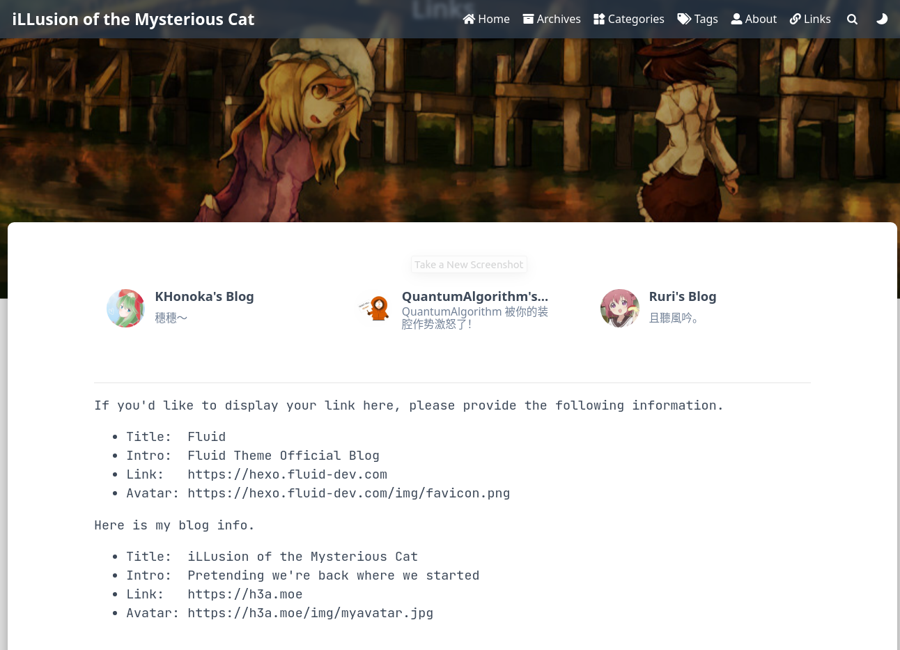
One link title just wouldn’t show up fully. It looked terrible.

Solution: Modify the Settings Manually
I inspected the elements of the page.
And the responsible part looked like this:
<div class="card col-lg-4 col-md-6 col-sm-12">Certainly, the author employed Bootstrap Grid System to divide space for each link. But his presetting is quite small, I think.
The whole container is divided into 12 columns horizontally.
For large screens, each card gets 4/12 of the width.
For medium-sized ones, that’s 6/12.
For smaller ones, it reaches 12/12.
In this compact layout, many titles would overflow and be left out, with “…” on the screen.
So I’d love to spare more room for the cards.
Well, the preset page setting of links page is located in/node_modules/hexo-theme-fluid/layout/links.ejs
All I have to do is to set the number a little larger. By the way, I inserted a few words above the cards as well.
<!-- /node_modules/hexo-theme-fluid/layout/links.ejs -->
...
<div>
  <p align="center" style='font-family:monospace; font-size:90%'>
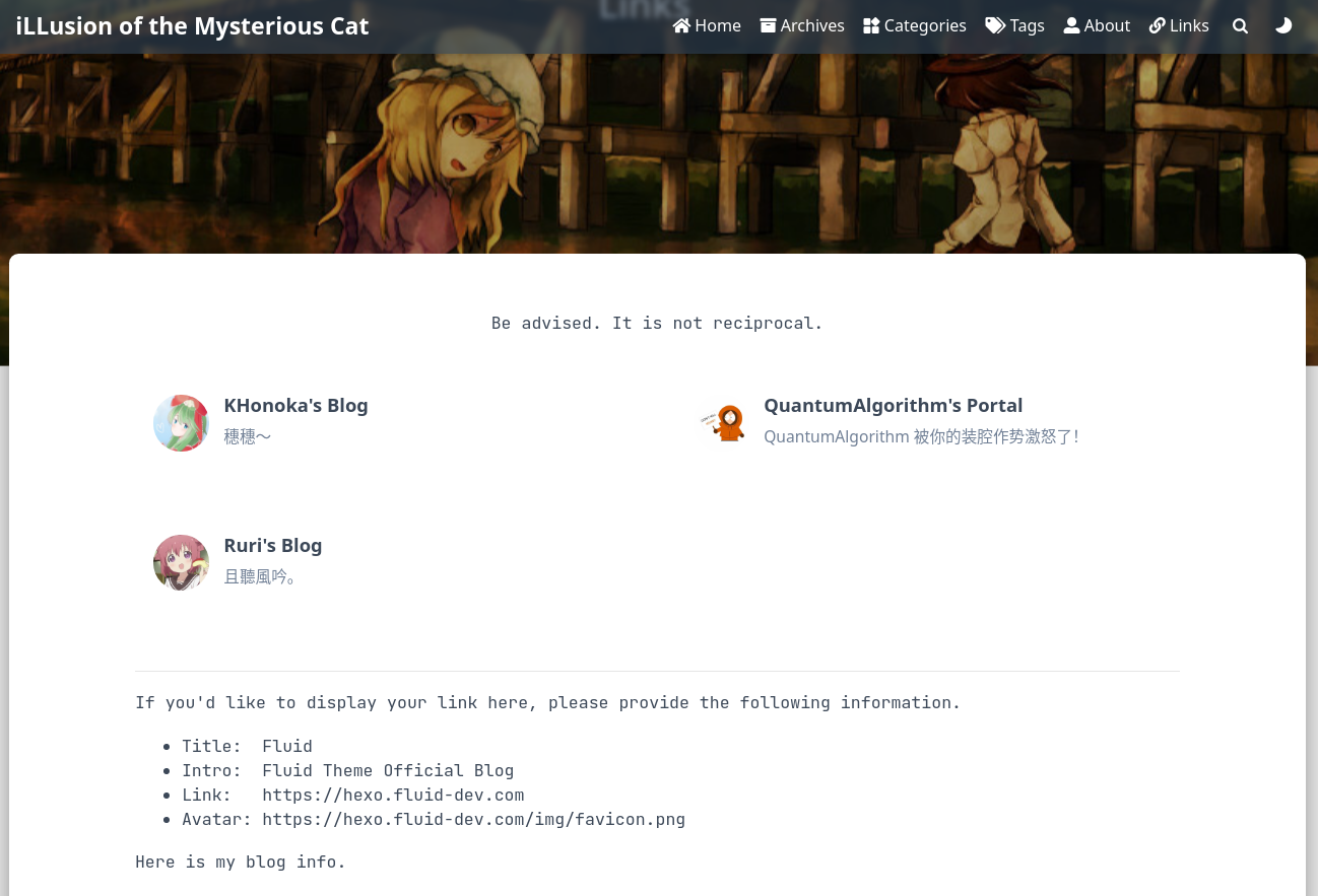
    Be advised. It is not reciprocal.
  </p>
</div>

<div class="row links">
  <% for(const each of theme.links.items || []) { %>
    <% if (!each.title || !each.link) continue %>
    <div class="card col-lg-6 col-md-12 col-sm-12">
        ...
Now it looks much better.

One More Thing: Build the Site on the Local Side
Well, the cloudflare application seemed to ignore my modifications in the theme layout.
For the time being, I have to build from my end.
Since my .gitignore is empty, I just needed to execute hexo g and push the public folder to my GitHub repo, then clear the build command on CF Pages and leave it empty.
Cloudflare just needs to deploy my pre-generated files.